Introduction
From 2017 to 2020 I was the Lead Product Designer at Qobuz, a high-end music streaming service for audiophiles. It also includes an online store where users can buy their favorite albums in high definition (basically like an HD version of the iTunes store). What is more, an editorial team provides contents that are included in the service: album reviews, feature stories about music and interviews.
Qobuz was founded in 2008 in Paris and is available in 12 European countries (including the UK) and in the US since 2019. In the first years of the company, a lot of focus was made on jazz and classical music and, partly due to this reasons, the user base is older than on most other music services: the typical user is an urban male above 40 years old (who can afford to buy high-end hifi equipment).
As the main Product Designer, I was responsible for the design of every Qobuz product: web & mobile applications (iOS and Android), but also the company’s website and the online store. In the following case study, I will not be able to detail every aspect of my daily job at Qobuz, but I will try to convey a global vision of how I tried to build the best user experience I could.
Branding
Even though it wasn’t my primary mission, one of my first concerns when I joined the company was to convince the management to change the brand’s visual identity.
Indeed, there was a confusion between the actual brand logo and the mobile app icon (typography was different, resulting in two versions of the “Q” letter). It gave the impression of having two different entities and it wasn’t possible to display the Qobuz logo next to its icon, like most brands do.
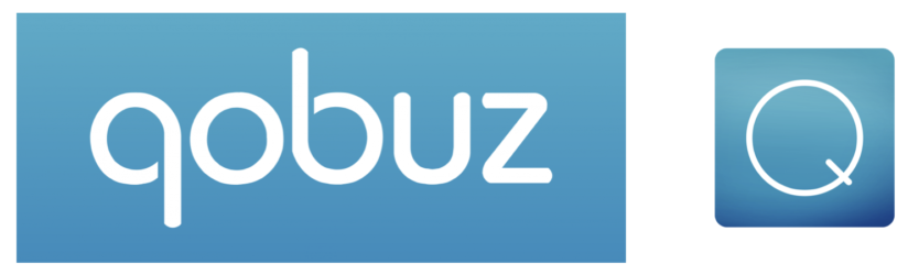
An updated version was submitted by an external Art Director and adopted in 2018. Although it is not perfect to my opinion (a vinyl record for a digital service?) it solved most of the issues related to brand identity. During these changes, I was involved in most of the decisions concerning Qobuz's brand image and overall artistic direction.

Redesigning Qobuz
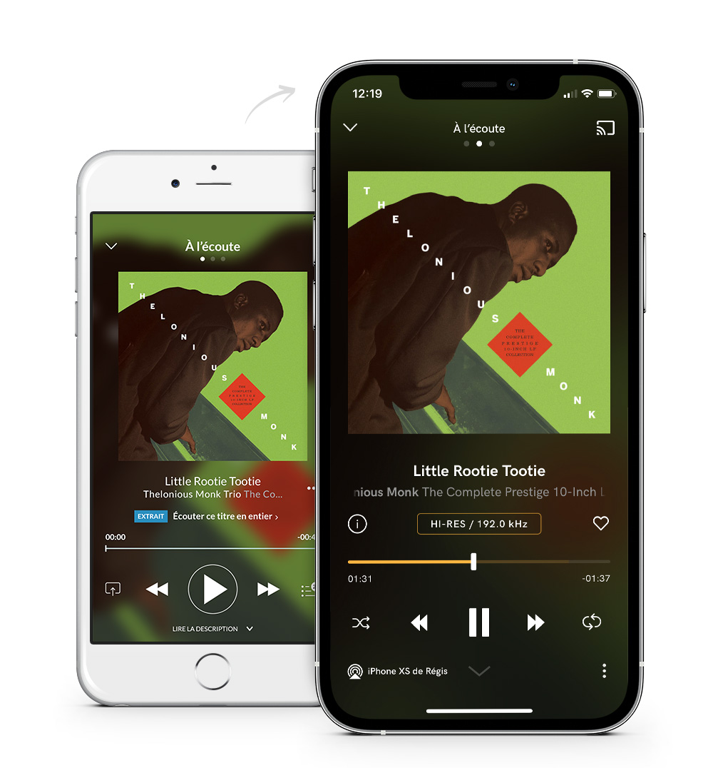
But actually, the core of my mission was to redesign the different Qobuz apps (desktop, iOS & Android). To start, I decided to focus on the Album page, which is the central element of Qobuz (unlike other music services which may focus on playlists or artist radios).
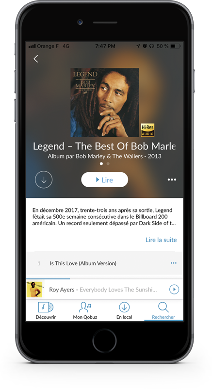
Back in 2017, the Album page showed several issues :
- Very tiny text that was hardly legible (keep in mind that our core user is above 40 y.o.)
- No possibility to add the album to favorites (although essential for user retention)
- Some layout issues (the floating Hi-Res logo)
- A dated visual style and a lack of contrast between the different elements
After looking for solutions for these different issues, I finally ended up with the following design:
- The Play button which is the most important element of the page was replaced by a prominent electric blue button on the right (since most users are right-handed).
- Also a key feature, the Favorite button was moved from the contextual menu to show it below the album cover and next to the Download button.
- In order to highlight the cover and have some contrast, I increased the background blur and made it darker. I also made the album cover bigger (we love to see our favorite artists’ artworks, right?) and moved the Hi-Res icon below.
- The album and artist names were positioned below the cover too, but I limited the text width to keep it aligned with the artwork and icon (the text is automatically scrolling if it is too long).
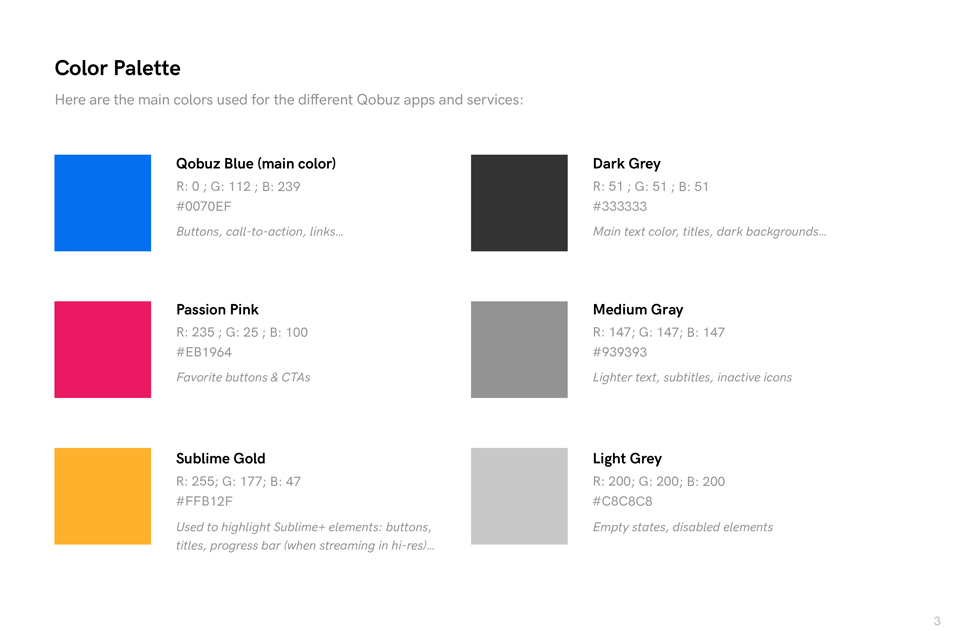
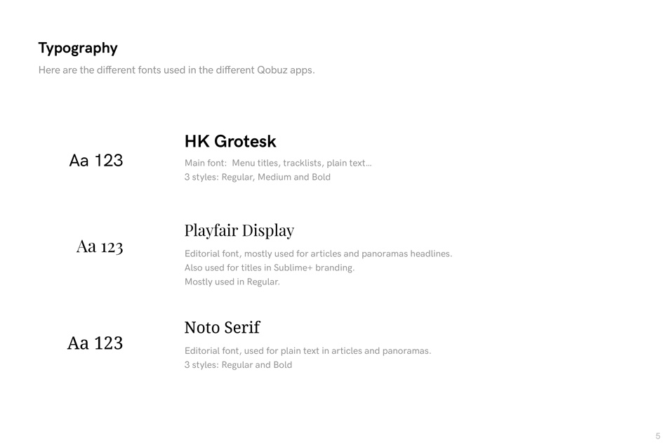
- Finally, I changed the font for HK Grotesk which looks more modern and increased its size to improve the readability.
After this redesign work was made for the album page, I started working the other pages. But in order to apply these new design rules to the whole application and to help the developers, I wrote a short document explaining the UI guidelines. This new design system was then applied on every other section of the mobile app but also on the desktop app and the Qobuz store.
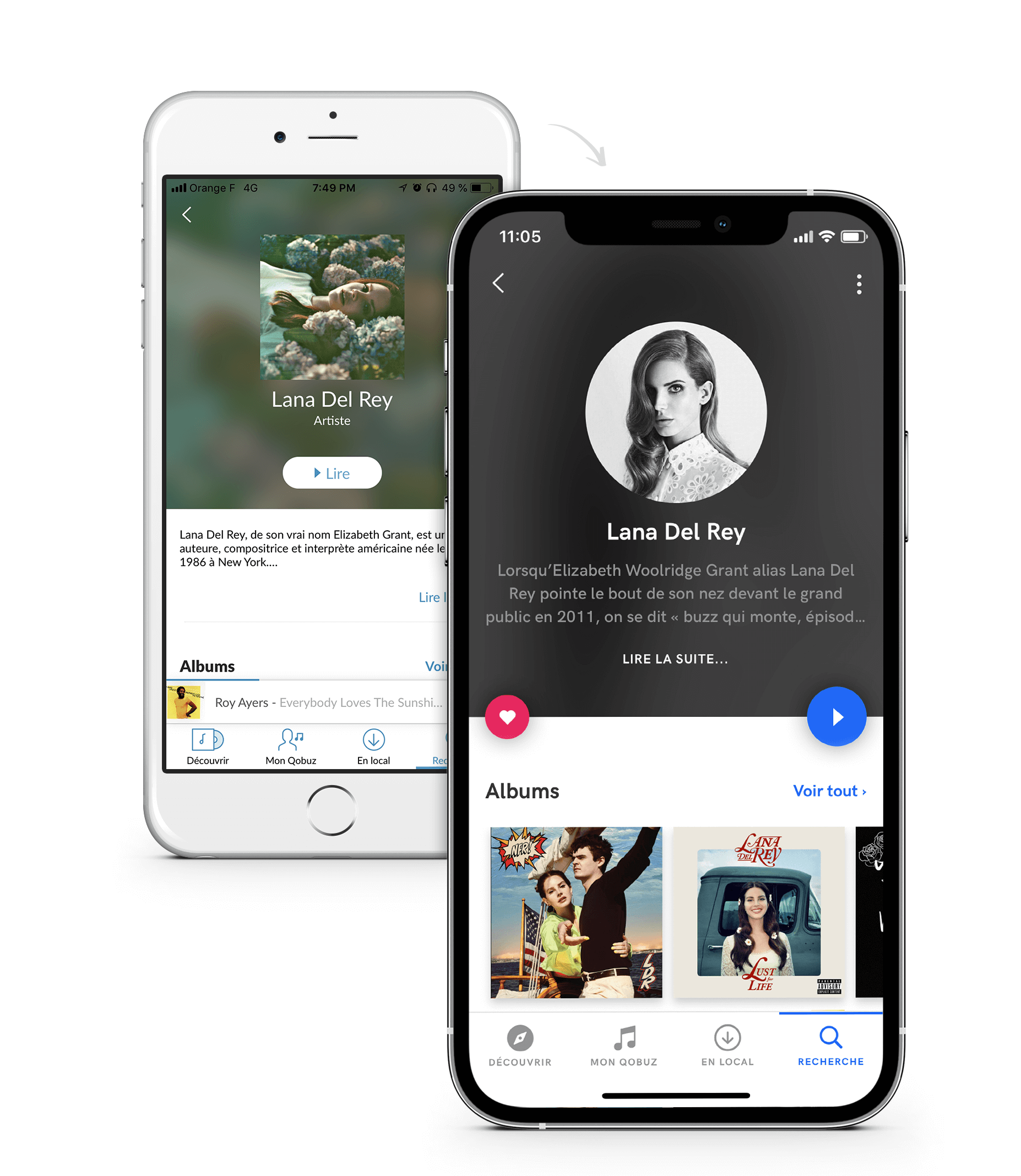
You can see below a preview of the new design guidelines. This document was a reference guide for the developers and the product team each time we were looking to add a new page in the apps or the website. The goal of this document is to evolve in time and it will be updated by my successors in order to keep Qobuz visual identity up-to-date.
Funny fact: in May 2020, almost two years after this redesign was done on our mobile apps, we were suprised and happy to notice that Spotify had adopted almost the same layout than us on its Artist and Album pages. It finally convinced us that we had made relevant design choices :)
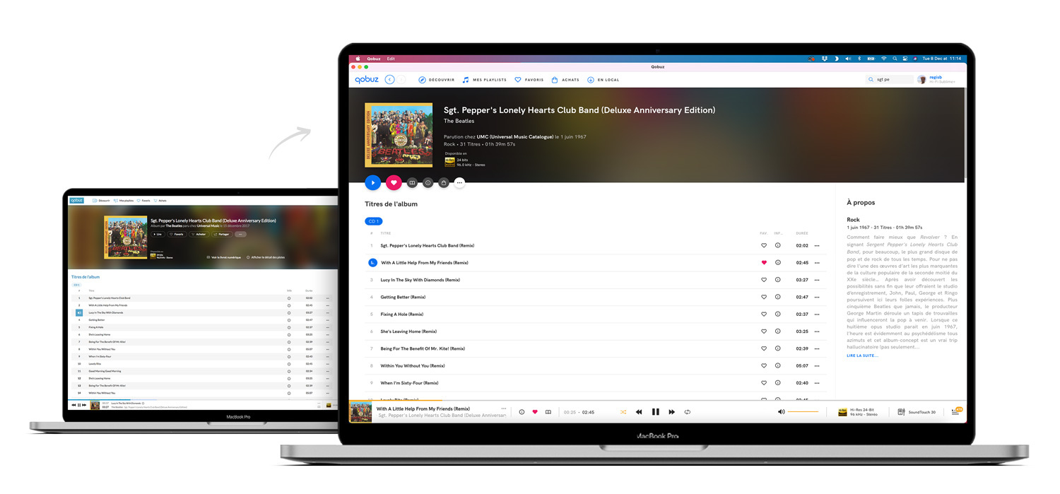
Qobuz Website & Store: Tools For Acquisition
During my experience at Qobuz, I had a lot of discussions with the marketing & growth teams to find ways to improve the acquisition and the retention of the service. By analyzing the metrics we had, we noticed that the Album pages of the Qobuz Store were the most visited, partly due to the fact that they contain a lot of information (tracklist, album review, full credits, etc.).
This is how we came to the conclusion that we should use these pages in order to convince users who were buying albums on Qobuz to try the streaming service instead (with the 1-month free trial). We were inspired from Amazon, which offers you to try their streaming service to listen to the album you're currently looking at.
And this is how we ended up to redesign the header of our Album pages (see below):
Due to technical constraints (and a lack of staff), it wasn't possible the revamp completely the Qobuz Store (though I advocated for it many times) but these small improvements helped us to increase the number of trial periods.
Audio Quality Page
Another content page was crucial on Qobuz Website: the Audio Quality Page. It was dedicated to explain exactly what are the differences between the different sound qualities (MP3, CD & Hi-Res) and which type of hi-fi equipment you need to fully enjoy Qobuz. This page generated a lot of traffic, but its design and content were out of date.
So we decided to rewrite it and redesign it fully, by keeping in mind that we had to optimize it for SEO and acquisition. I worked alongside with Maxime Charpentier, a great front-end developer to imagine the different animations and transitions we could have on this page.
You can check this page online or see a preview below:
Additionally, we added a small tutorial to help users to find the ideal equipment for you to enjoy Qobuz (whether you are are at home or on the move, on Android or iOS, etc).
All these projects were made for the same goal: improve acquisition and increase the number of trial periods, which has been quite successful.
Conclusion
This case study is just a glimpse of the many projects I've had the chance to work on at Qobuz. I tried to keep it as short as possible to make it easy to read, but feel free to contact me for any further information. Unfortunately, many of the new features I had imagined for the apps, like My Qobuz (an updated user library) or My Weekly Q (recommended playlists based on your listening history) have not been released yet, due to technical constraints and the small size of the development team.
However, I am very happy and proud to have been part of this adventure and to have develop this service for three years. Qobuz is a really singular product, built for passionates by passionates. Even though I've left the company today, I'm still an avid user of Qobuz and can't wait to see what happens next!