You will find the complete case study for Guroo below. For a shorter version, click here to discover of the app UI and its main features.
Intro
In 2016, as the Lead Designer on Guroo Chat, my mission was to create a brand from scratch and design an unique user experience for this innovative messaging concept.
Guroo is a new generation mobile messenger with a unique value proposition. The app allows users to send anonymous messages through an intermediary (the “Guroo”) that has the power to deliver the message or not if he/she judges it inappropriate. The identity of the sender is secret for the recipient and the Guroo, they only know that this person is part of their network (either a direct friend or the friend of the friend).
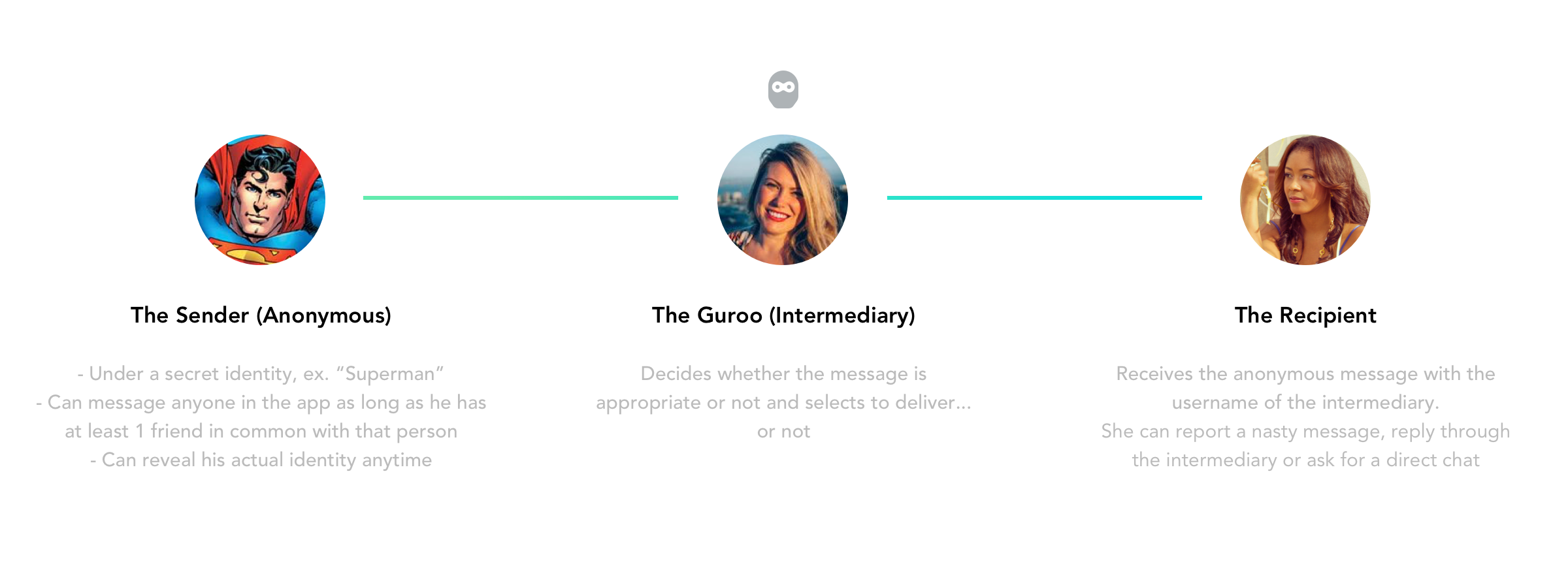
That means that the app always places a mutual friend as a safeguard that curbs unwanted behavior or brokers a stronger connection.
Benefits:
- Have fun, anonymous conversations
- Be a part of other people’s chats, like a fly on the wall
- Approve or reject messages within conversations
- Rely on friends to reject messages they don’t want to see
- Create and embody unique and fun identities
- Try to unmask anonymous messengers
- Prevent from cyber bullying, harassment or inappropriate content
Branding
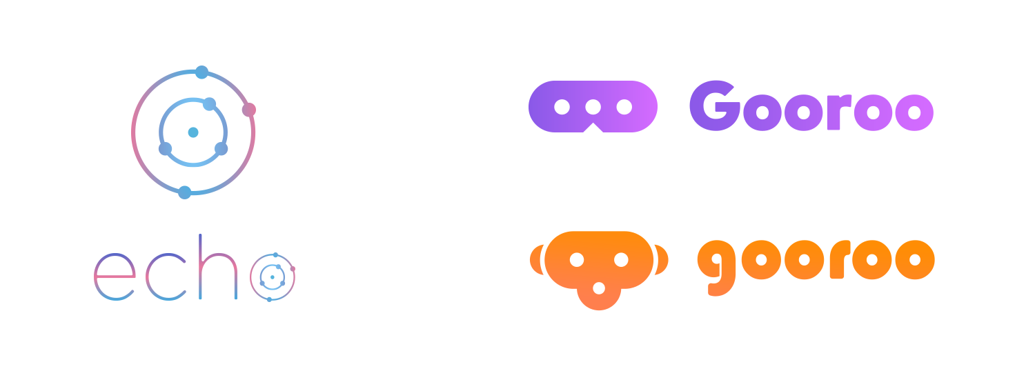
One of the main challenges on this project was to define the name of the product and then build a brand around it. After long discussions with the shareholders and project managers, "Gooroo" was the name that finally made the cut. However, due to legal issues, we chose to spell it "Guroo" for the final version.
Before this final name was decided, I had proposed different options for the app logo. You can see below some of the initial proposals ("Echo" was of one the original names' options).
Once the final app name was chosen, I started to focus more on the logos concepts and on which values the brand had to spread. Since our main target was mostly teenagers who have a generous usage of smartphones and social platforms, we thought the logo should look playful, a bit mischievous and also reflect the idea of being anonymous. The main usages of Guroo, we thought, would be mainly doing jokes to your friends, and potentially flirting.
I consequently started to explore concepts that would go in that direction. As a huge hip hop music listener, after some research, my most relevant logo idea came from the inspiration of Oxymoron's artwork, a rap album by Schoolboy Q:
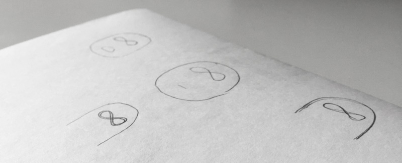
Some of my research to find the appropriate look on paper...
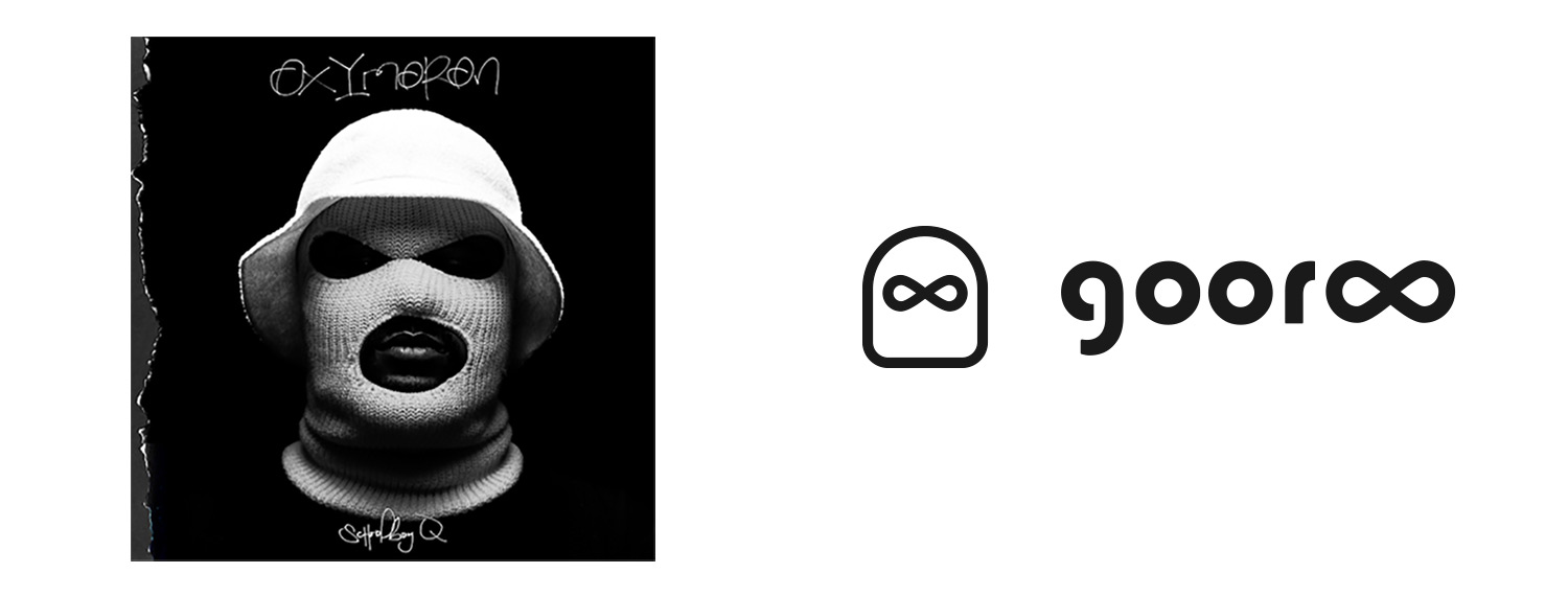
On this great record cover, the artist's face is hidden by a large hood that gives him a very shady look. I then tried to refine a little my original drawing by making it more cheerful and less threatening. In addition, I introduced the blue and green gradient that would define the main color used on the whole app interface.
This is how I ended up to this final result:
UI & UX
During the first months, we decided to focus our efforts to define a clear user flow with simple black & white wireframes. For the MVP version, the user had to be able to sign up with his phone number, create a new chat by browsing all the recipients available in his network (which includes his friends + the friends of his friends), choosing a secret identity and then send messages.
Additionally it should also be possible, as a Guroo, to moderate a conversation by delivering or rejecting the incoming messages, add friends within the app or invite contacts to join it.
You can see some of those wireframes below:
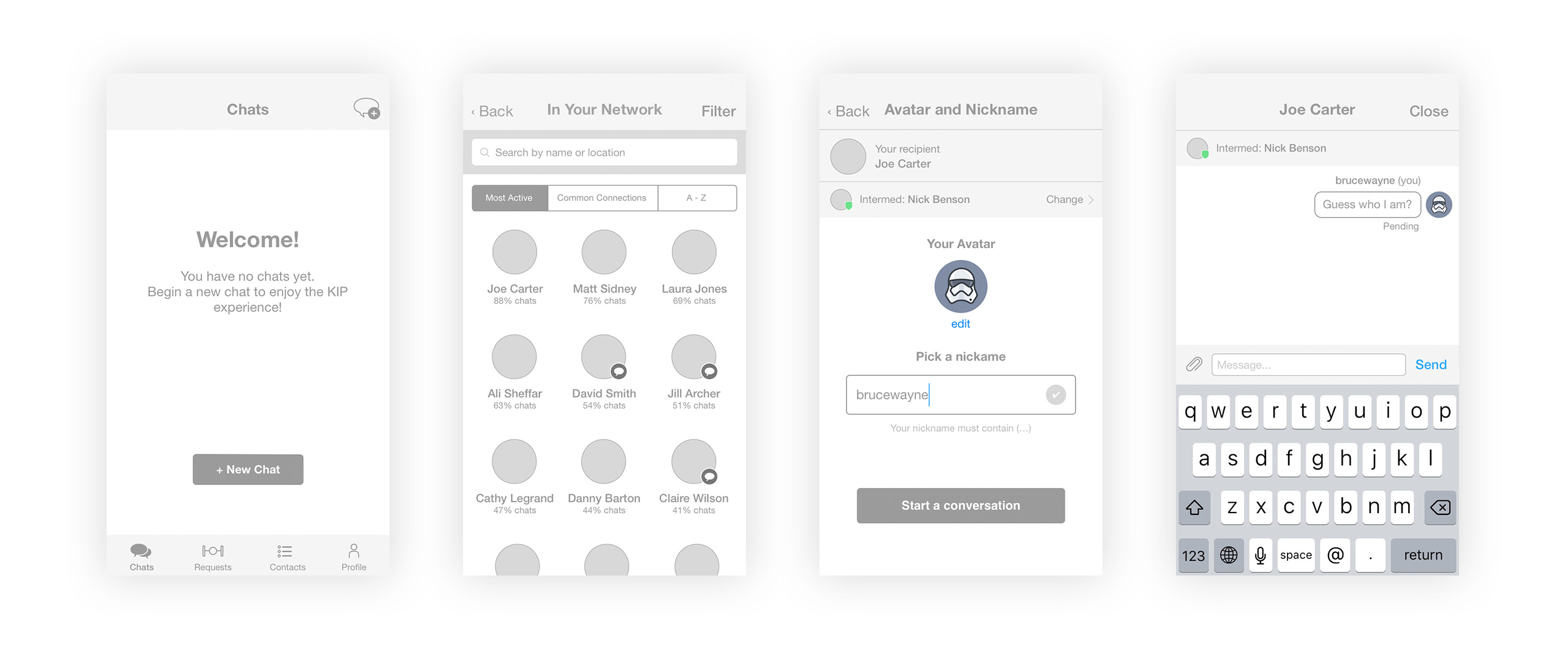
Then, I applied the visual identity I had created to those wireframes to get this first version of the app mockups you can see below.
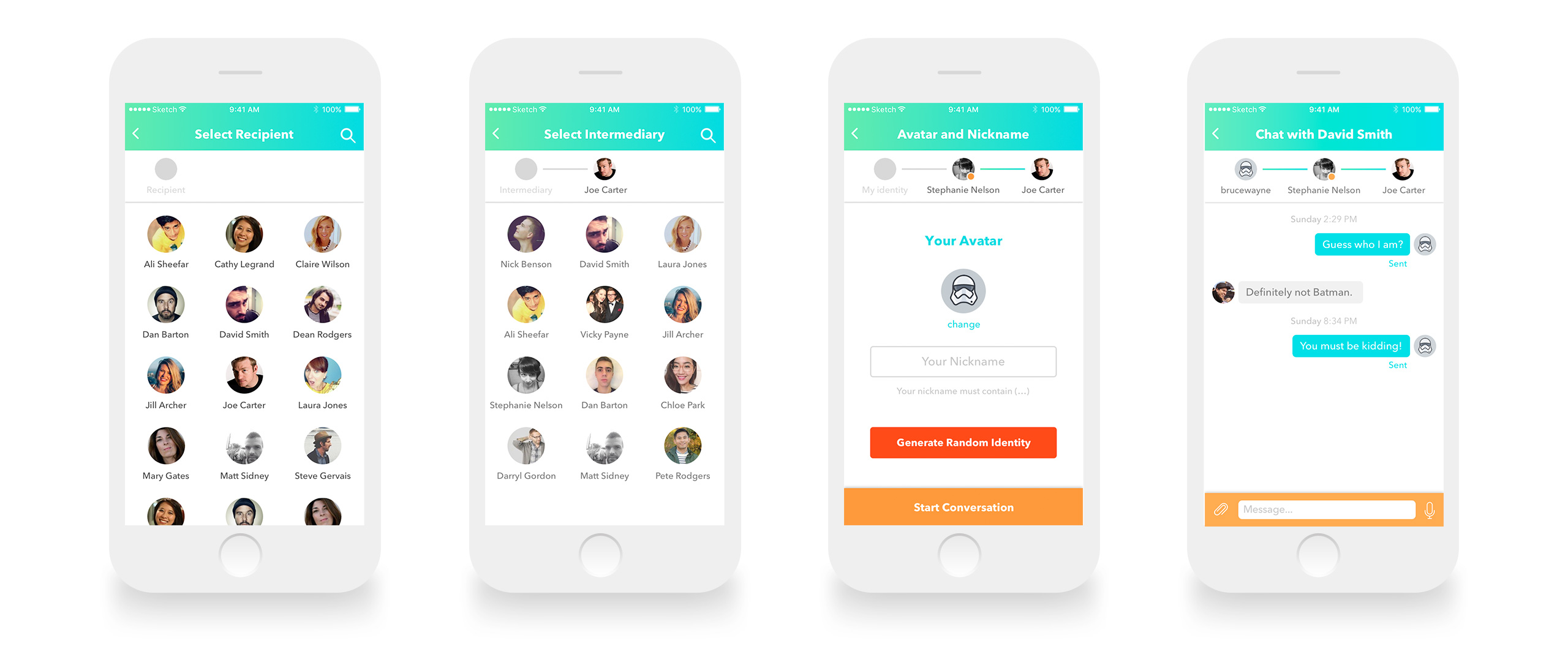
However, after implementation on both iOS and Android, we quickly noticed that the user flow wasn't well optimized: the onboarding was too long, some features remained unclear and the global UI looked a bit too childish.
Though the blur we left on some features was intentional (we were focusing on teenagers as our main target), the shareholders feared that we might confuse some users too much and lose them.
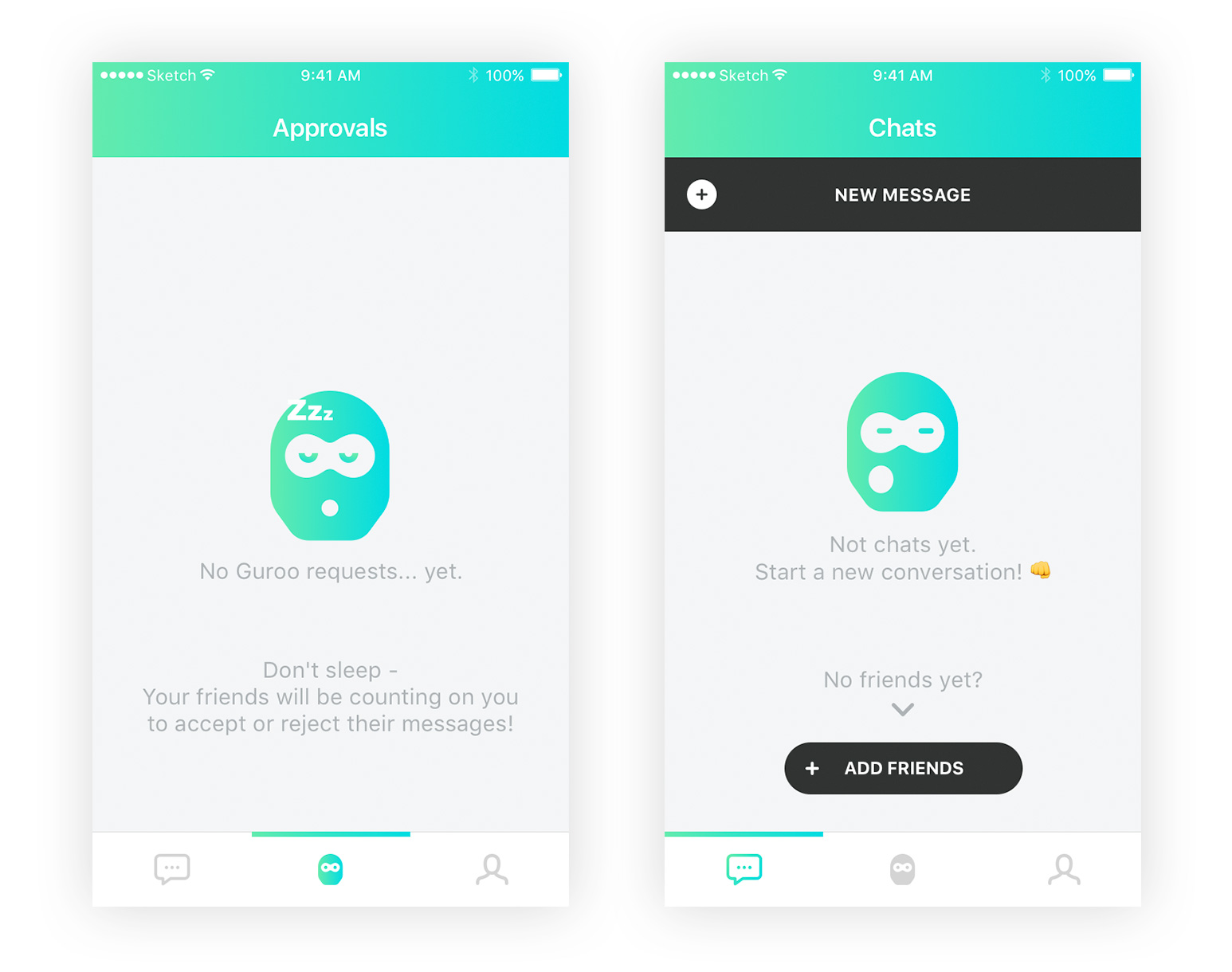
Therefore, we started to rethink the UI and the user flow. During this process, we also decided to exploit the empty states in order to add some humor and increase the brand visibility. See examples below:
Additionally, we tried to make the onboarding and the flow to create a first conversation as smooth and clear as possible. That's why we added a very short tutorial that only appears once, the first time you use the app.
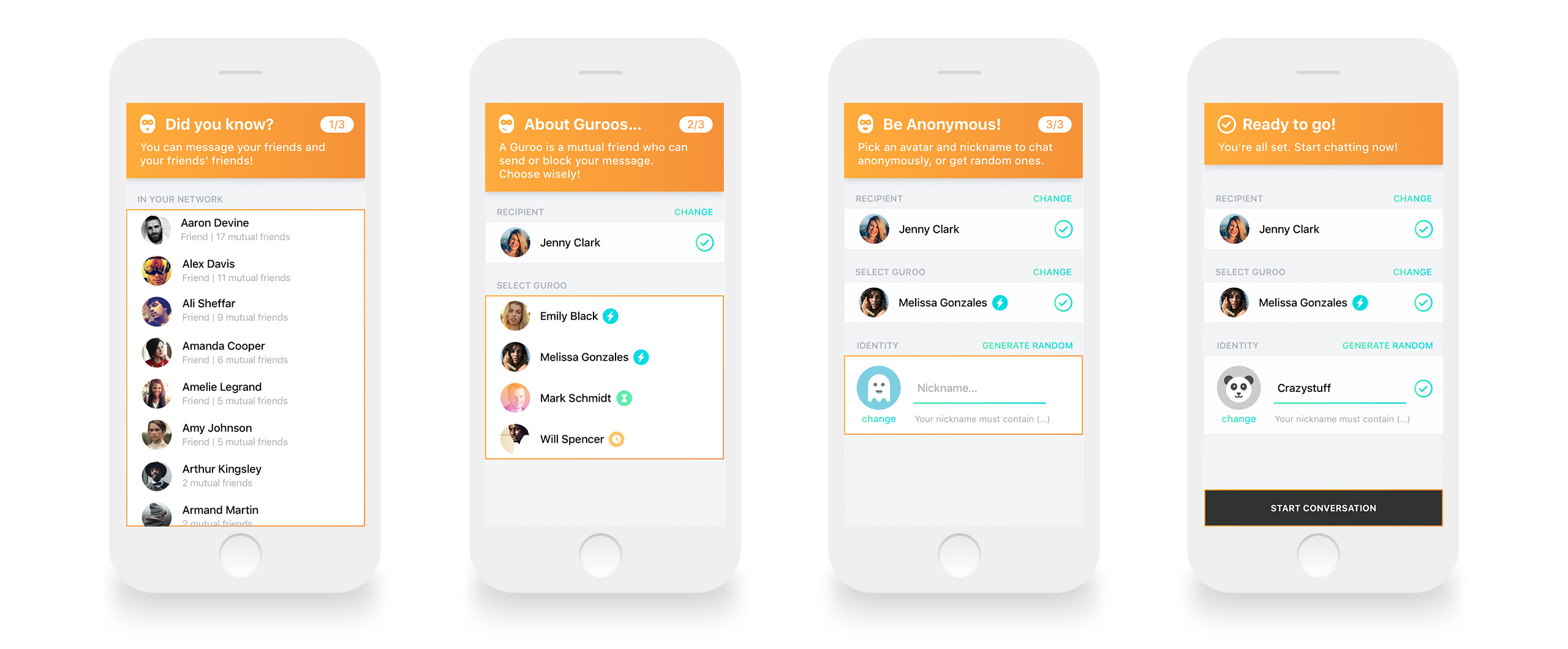
The colored icons next to Guroo names are speed indicators: blue is the fastest (the bolt), and the orange is the slowest. That way, the potential intermediaries are ranked by their speed to help you choose the most responsive one for your chat.
Approve or Reject a Message
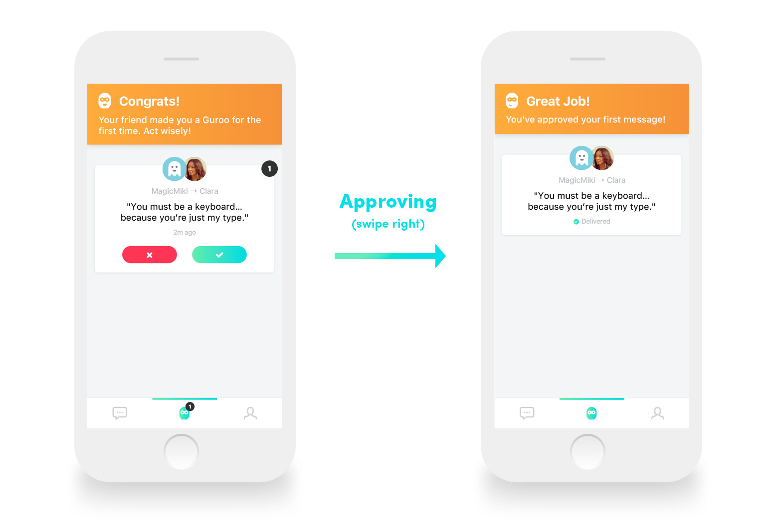
Now, here comes the funny part. We mentioned previously that, as a sender, you can send your messages anonymously with the help of a Guroo (the intermediary). Let's focus a bit more on the role of the Guroo.
The first time you get a Guroo request, you will notice a small badge next to the Guroo icon on the nav bar, showing you the number of messages you have to process (deliver or reject). You simply have to swipe the message card right to deliver it to the recipient, or left to reject it.
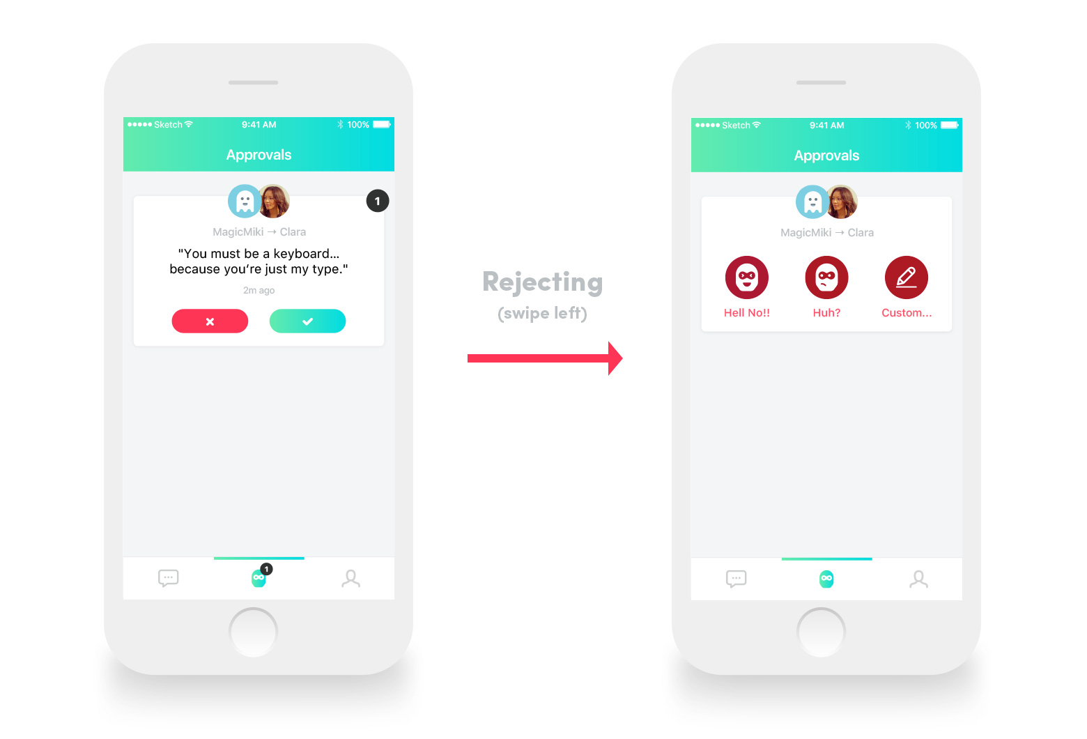
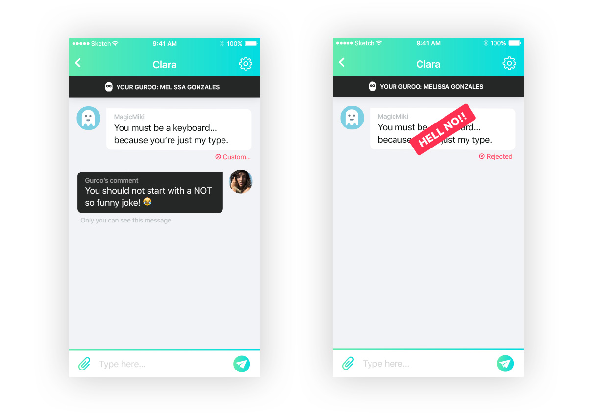
In case of rejection, a few different options are proposed to justify your choice to the sender. You can, for example, leave him a short comment to explain you decision, or put the accent on the rejection with a huge "Hell No!!" label if you judge the message inappropriate.
Check it on the examples below:
Conclusion
There many other funny features of the app I haven't mentioned. For example, as a Sender (anonymous), you can decide to reveal your actual identity anytime during the chat by taping on your avatar. You can also, if not satisfied by your Guroo (for example, if she/he is too slow), decide to switch him/her for another friend you have in common with the recipient.
There are also many ways to make the product evolve in the future. For example, by including GIFs and stickers in conversations, including more gestures to the UI, or allowing the Guroo to request the sender's identity. For a quick look to the final UI, please take a look at the showcase here.
Thank you for reading this case study. I hope you will enjoy playing with Guroo as much as I enjoyed designing it!